Everlasting
Dr. Mỹ An T. Nguyễn and I go all the way back to elementary school when we were two new kids immigrated from Việt Nam. Right from the start when took ESL (English as a Second Language) classes together, I knew she would become successful later in life. Despite her limited English, she excelled in all subjects from elementary throughout high school.
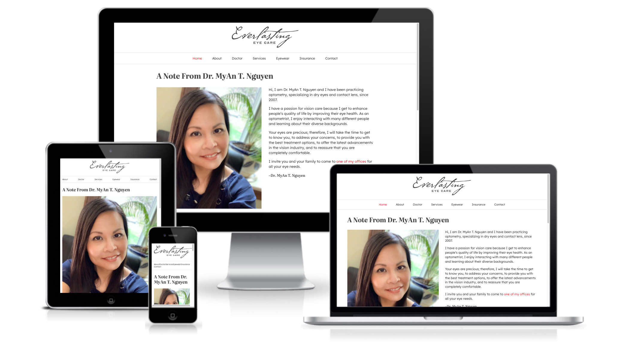
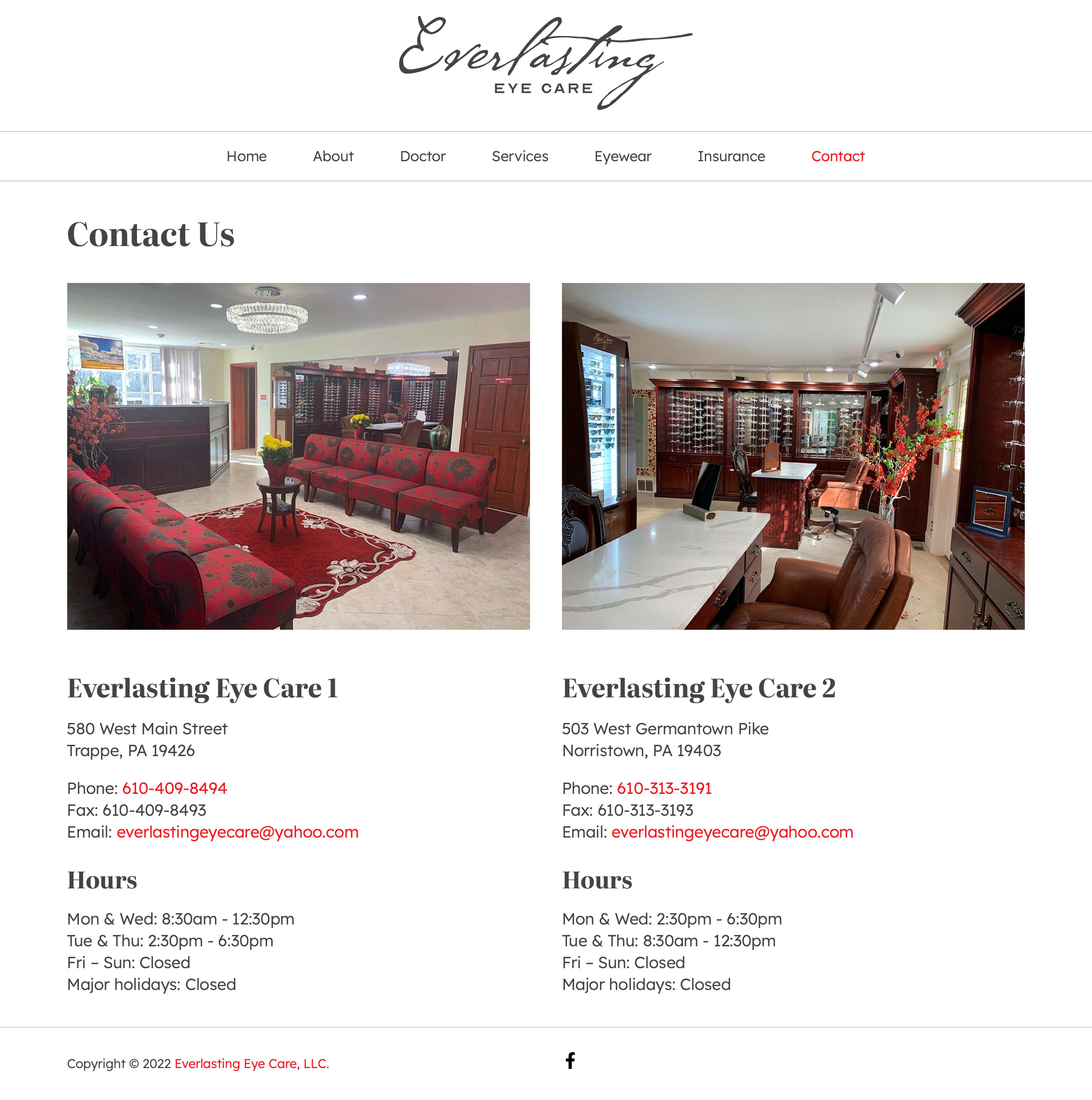
After more than two decades of losing contact, we rekindled our friendship. As I had predicted, she has become a successful optometrist who runs two eye-care offices. When she reached out to this old friend of hers to help redesign her website, I could not refuse. Her goal is to showcase both of Everlasting Eye Care offices on one website. She also wanted her site to be easy on the eyes with personal attention in the message.
Website Redesign
In conducting my research for the redesign of Everlasting Eye Care, I looked around at other optometry websites to see how they are done. What I have found are similar templated designs on their homepage with stock photos of people wearing glasses, a few marketing words, and a big button to schedule an appointment. They all claim to be “personable” and yet they all look and feel generic.
In talking with Dr. Nguyễn, I felt the deep passion she had for her profession and the genuine caring she had for her patients. As a result, I decided to scrap all the marketing materials on the homepage and just put up a personal note from Dr. Nguyễn:
Hi, I am Dr. MyAn T. Nguyen and I have been practicing optometry, specializing in dry eyes and contact lens, since 2007.
I have a passion for vision care because I get to enhance people’s quality of life by improving their eye health. As an optometrist, I enjoy interacting with many different people and learning about their diverse backgrounds.
Your eyes are precious; therefore, I will take the time to get to know you, to address your concerns, to provide you with the best treatment options, to offer the latest advancements in the vision industry, and to reassure that you are completely comfortable.
I invite you and your family to come to one of my offices for all your eye needs.
I just love that she wants to enhance people’s quality of life by improving their eye health. Her message is relatable and a nice photo of her added a personal touch. When you come to one of her offices, you know exactly who will take care of your eye health.
Typography
The body text for the website is set in Lexend, designed by Bonnie Shaver-Troup with Thomas Jockin, Santiago Orozco, and Héctor Gómez, for comfort reading experience. Headers are set in Literata, designed by Vera Evstafieva, Veronika Burian, Irene Vlachou, and José Scaglione, for high-contrast display to grab readers’ attention.
Word Mark
As a bonus to an old friend, I created a new word mark for Everlasting Eye Care. I combined P22 Cezanne, designed by James Grieshaber and Michael Want, with Optician Sans, design by ANTI Hamar and Fábio Duarte Martins. While the fancy script, which based on Cezanne’s handwriting, provides a free, creating vision, the geometric sans, which based on the LogMAR Chart, provides legibility for visual acuity. The two contrasted typefaces complemented each other for the word mark.

With Dr. Nguyễn’s busy schedule, the site took a long time to launch, but it is my pleasure to redesign the new Everlasting Eye Care website for my friend.
Visit Everlasting Eye Care website.
Praise
Hi Donny, I loved the story of your “forever” friendship with Dr. Nguyen… nothing better than forever friends! I am thrilled to see you are using Lexend for your website. I am honored that you made the important decision to focus on both legibility and readability for Everlasting Eye Care. It would seem important, but many still do not know the importance of the fonts that we present. Kudos on both your design choices and content for the website! Lovely!
PS I love the wordmark that you created—it is beautiful.
– Bonnie Shaver-Troup, EdD, Creator of Lexend